10 Checkout Mistakes That Can Hurt Your Conversions
- 17th August 2017
- Ecommerce
- 0 comments
If you’re generating a good amount of targeted traffic to your eCommerce store, but that traffic is not turning into sales, something might be wrong with your checkout process.
Some website owners think the solution is to send more traffic to the site. But you might be better off optimising your current traffic instead.
Online checkout optimisation is something you cannot afford to get wrong. Here are 10 common mistakes that could be hurting your sales.
1. You’re not using a progress bar
The progress bar has become a mainstay of eCommerce checkouts, and there’s a good reason for this. A progress bar improves the experience for shoppers and encourages them to complete the checkout.
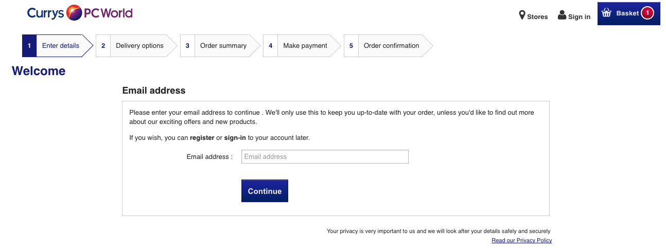
A progress bar clearly displays the different stages of the checkout process (e.g. personal details, delivery options, payment, etc) so that the shopper can see exactly where they are, like in this Currys’ checkout:
Why are they so useful? Think about it: in an online store, you can only see what’s on the screen. If a shopper keeps on completing steps and clicking through to the next page only to find yet another stage they weren’t expecting, they might give up entirely.
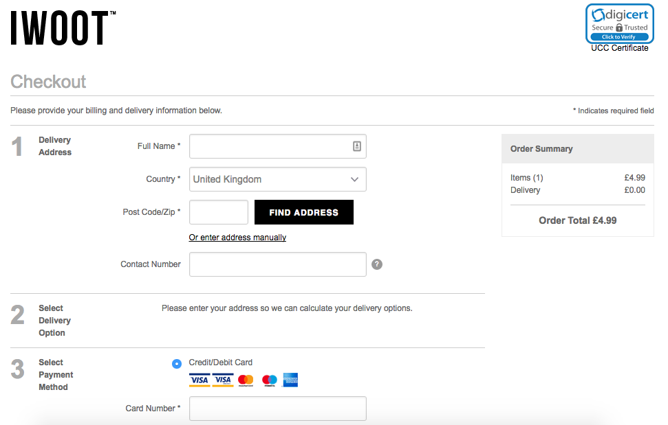
Alternatively, if you can fit all of the stages onto a single screen, that could be even better. I Want One Of Those does this by including three simple stages all on one page followed by a ‘Submit My Order’ button:
2. Pages are too slow to load
Nothing good comes of slow page loading times, especially on eCommerce sites. If shoppers have to wait every time they click on a product or add an item to their basket, they are not going to be waiting around for long.
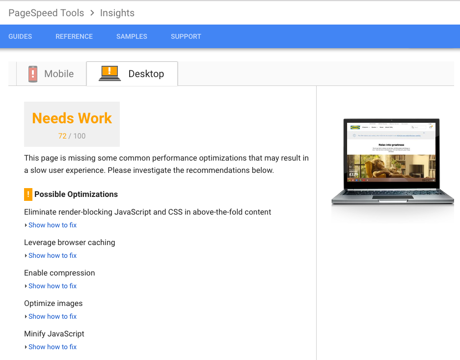
Test the speed of your web pages. Start with Google’s free PageSpeed Insights, which will provide a good overview of what you’re doing right and wrong, then make the recommended improvements to speed things up.
3. The checkout is too complicated
A fast website is good, but a fast checkout process is also needed, and you should go out of your way to make things easy for your customers.
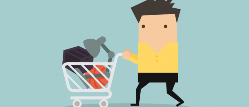
For example, when a customer adds something to the basket, they might want to edit it. You should allow them to do so in the checkout without having to go back to the store, which would break the momentum.
You should also provide thumbnails of items in the checkout. People make mistakes and they might forget what they had added, and a thumbnail image makes it easy to see exactly what’s there.
4. Shoppers don’t trust you
Trust is a big issue online. And if your shoppers don’t trust you, they’re not going to buy your products, no matter how good or competitive they are.
With hacks reported in the news every day and credit card details being sold by criminals online, it’s only to be expected that customers will only shop at stores that take their security seriously.
If you’re not, you need to start doing so. If you already are, then you need to make it apparent. Don’t assume that your security measures are obvious to visitors.
Show off your security symbols and awards, display your SSL security logo and PCI Compliance logo and make shoppers more relaxed on your store.
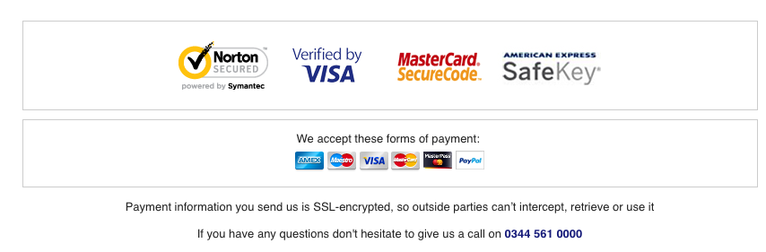
The design also has a role. A dated design is off-putting and can lead to a lack of trust. A modern, attractive design is far more reassuring.
You could also add testimonials and customer reviews – social proof is a big trust builder after all.
5. Your promotion code is too prominent
You might think that adding a promotion code field to your checkout is a great idea. But actually it could prove to be counterproductive.
When customers see a field to insert a promotion code, this might simply remind them that they might be able to get a better price – and they might end up leaving the checkout right when they are about to make a purchase.
This data from PayPal and comScore may be from 2009, but its results are clear: it found that 27% of people had abandoned a shopping cart in order to search for a coupon.
So what’s the alternative? You might want to test adding in a less prominent text link for customers who want to add a promo code. That way, customers who already have a code to use will find the link, but other shoppers won’t be overly distracted by it.
Kissmetrics has a detailed guide on promo codes if you want to read more on this topic.
6. You ask for too much information
Only ask for as much information as you really need in the registration process. That will usually be their name, address, password, and payment information.
Make it quick, simple and as fast as possible. If you want any other information, get it later on.
For the address, help your customers out. Allow them to type in their postcode and then auto-complete it. You could even use the Google Maps API, which can fill out an address based on where they are located (see here for more info).
7. There’s no guest checkout option
Guest checkouts are becoming increasingly common. Shoppers are tired of having to fill out all their details yet again, so give them the option of making a purchase as a guest.
If they return regularly, they’ll probably want to sign up, but don’t lose a sale because you insist on getting their details.
Smyths Toys does this by presenting its guest checkout option and explaining that shoppers can create an account after checking out:
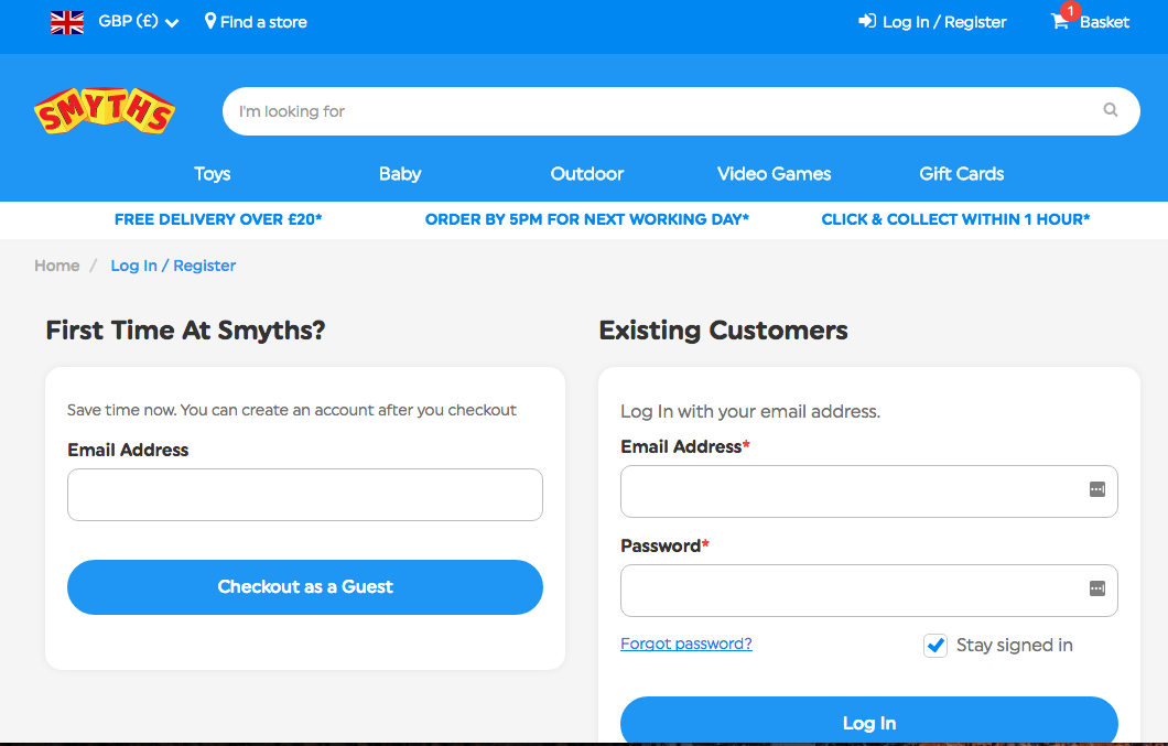
You could even set guest account as the default option to get shoppers into the checkout process as fast as you can.
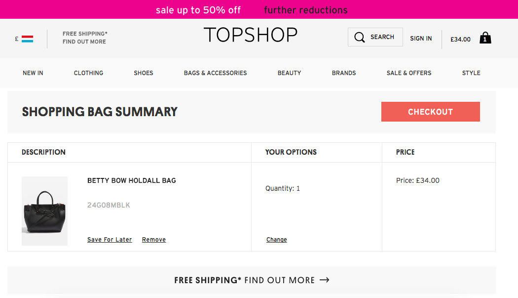
8. You’re not clarifying the shipping fees and return policy
People want as much information as possible when making a decision to buy. If you hide that information from them, they might be less likely to complete the purchase.
If you charge postage and packaging, let them know what this is early on, not right at the end. They might be disappointed and leave if they get a nasty surprise. And if you offer free shipping, use this as a selling point, like TopShop does by highlighting it in the basket:
It’s the same with the return policy. Provide some information about this, along with a link to more detailed information, and include details of it on every checkout page. IKEA does this on the first page of the checkout with its ‘365 Day Returns policy:
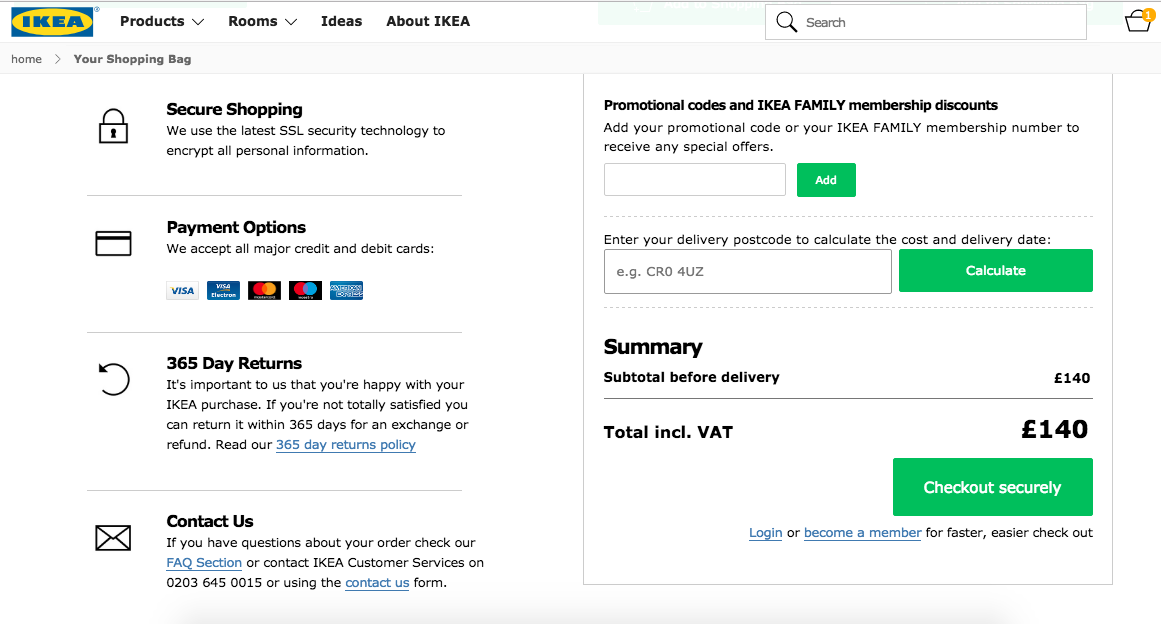
And ask for the payment information at the end, after clarifying shipping fees, not before.
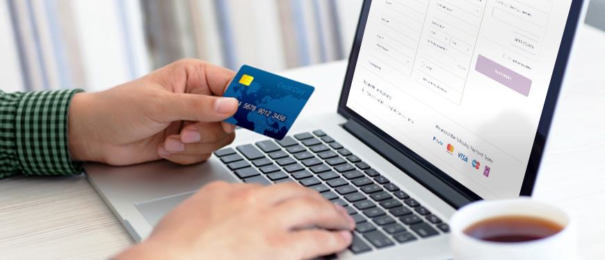
9. You don’t provide enough payment options
If you don’t offer enough payment options, you could be missing out. Why not offer other options like PayPal? Shoppers with PayPal accounts might prefer this over filling out their card details yet again.
Provide as many options as you can and it makes sense for you to do. There’s no reason to miss out on sales because of such a minor issue.
10. You have no customer support
Don’t assume that visitors to your store know exactly what to do, especially if this is their first time. Many will have questions about shipping, returns and products, so make sure someone is there for them.
Live chat is a great option because it’s easy for both you and your customers to use. But add a phone number if you can – just make sure someone is there to answer.
Optimise your checkout for sales
Are you making any of these mistakes? If so, it’s time to do something about it.
There’s no reason to lose out on sales because you are making minor mistakes that can kill your conversions. So go through your checkout process, work out what’s wrong and then do something about it to boost sales in your store.
Author
Steven Wu
Steven has been working in the eCommerce market for over 8 years. Specialising in Magento eCommerce development and has a passion for Wordpress. Has worked with clients such as HTC, Cisco, Hitachi, BT, Panasonic, HSBC and Natwest. Steven enjoys reading and rock climbing at the weekends.